Three years ago, we had an idea to create a community launderette in Anfield/ Everton with affordable washing and drying facilitates as well as a community arts space.
After a lot of hard work from our small team of workers and volunteers our building is beginning to take shape.
Soon we’ll be opening our doors but before we do, we want to share our journey! Our blog series gives you an insight into all the wonderful people bringing our vision to life.
For our second blog our lead designer, Louis shares his work on developing the look and feel of Kitty’s Launderette.
My name’s Louis and I’ve been leading on the visual identity for Kitty’s Launderette for the last 3 years alongside the team. I wanted to share some of the designs we’ve made and the thought processes we’ve had while developing them.
When designing the look and feel of the launderette, we had many conversations to develop the core values we wanted to communicate. It needed to feel clean and fresh as well as communicating our desire for more environmentally conscience processes. We chose a natural and vibrant green colour and added a sky/ freshwater blue as a neutral colour complimenting the green.
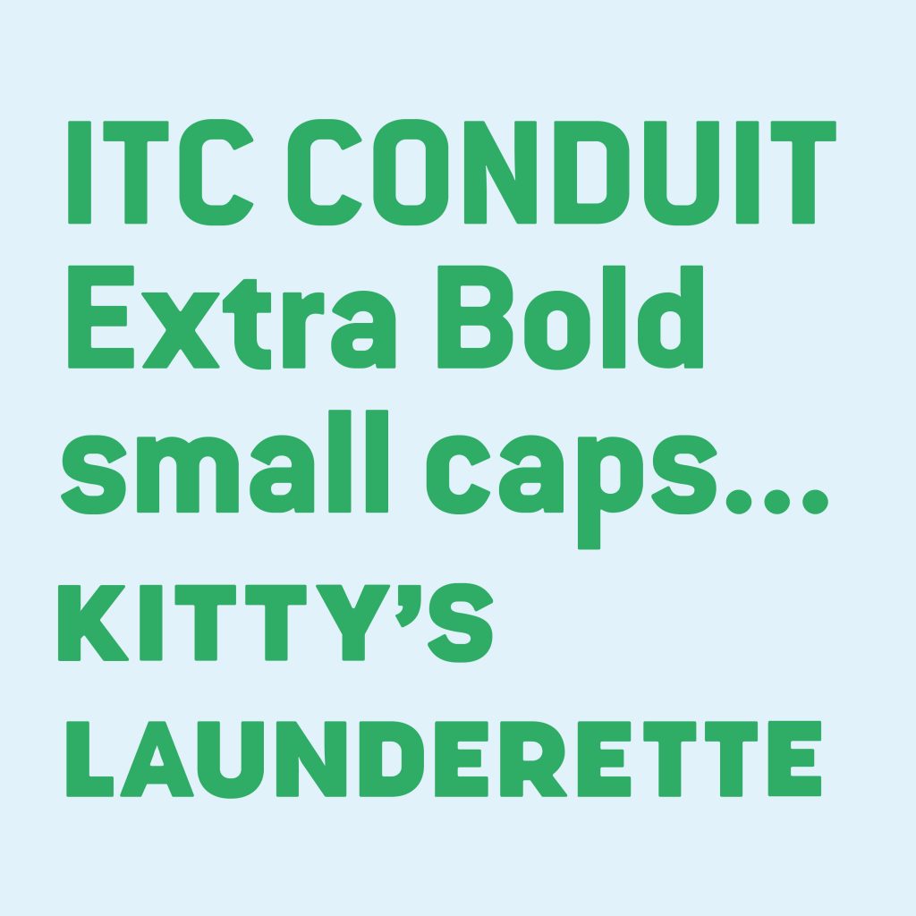
ITC Conduit Extra Bold was the perfect choice for a typeface because its design is based on the kind of letters used on laundry labels and also on the shapes created by pluming. I love the directness of it, it also has quite a lot of interesting quirks. I created a small caps version of the font too which emphasised the direct launderette feel we wanted.
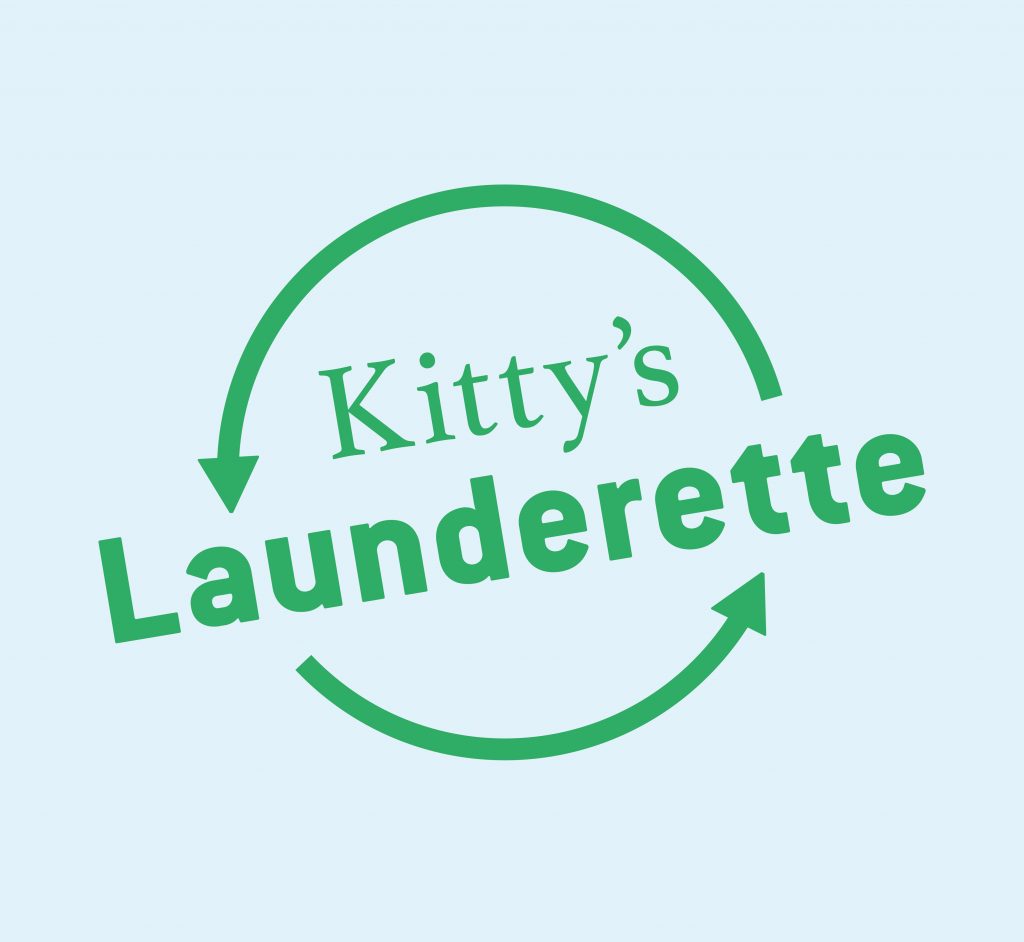
In keeping with this directness, the logo I created is simply Kitty’s Launderette spun round like a washing machine. I referenced laundry icons for this. I like that it’s simple enough that you could draw it by hand and instantly recognise it as Kitty’s Launderette.
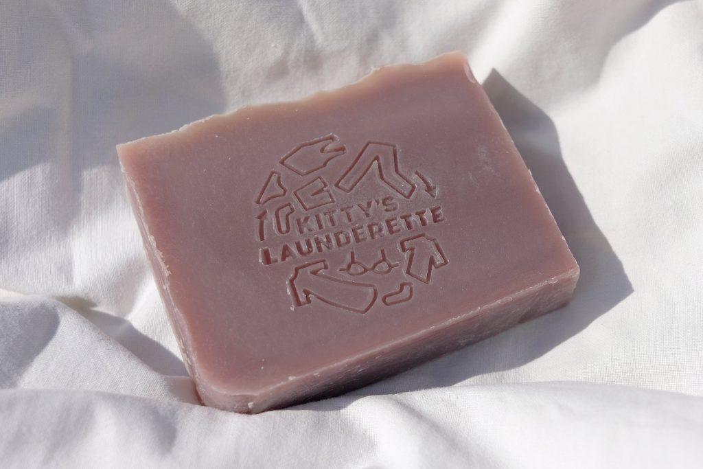
I went on to create some illustrations which developed naturally from these ideas. They relate to the directness of laundry icons but with a freer hand-drawn style shape. We first used these on the soap we made for the Kickstarter and have gone on to use them in other designs.
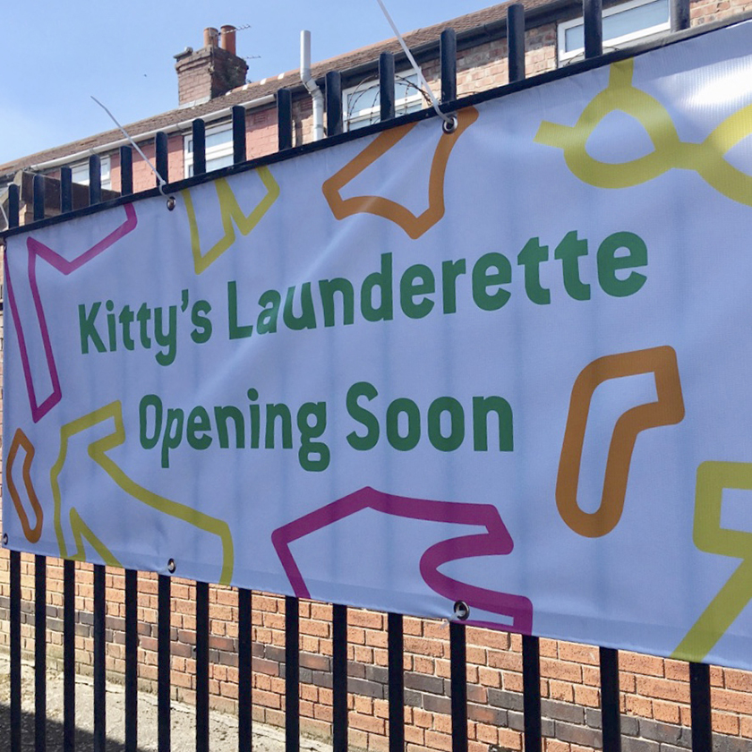
After trying this colour out on the initial flyers, we’ve begun to expand our palette with other vibrant and fun colours drawn from flowers.
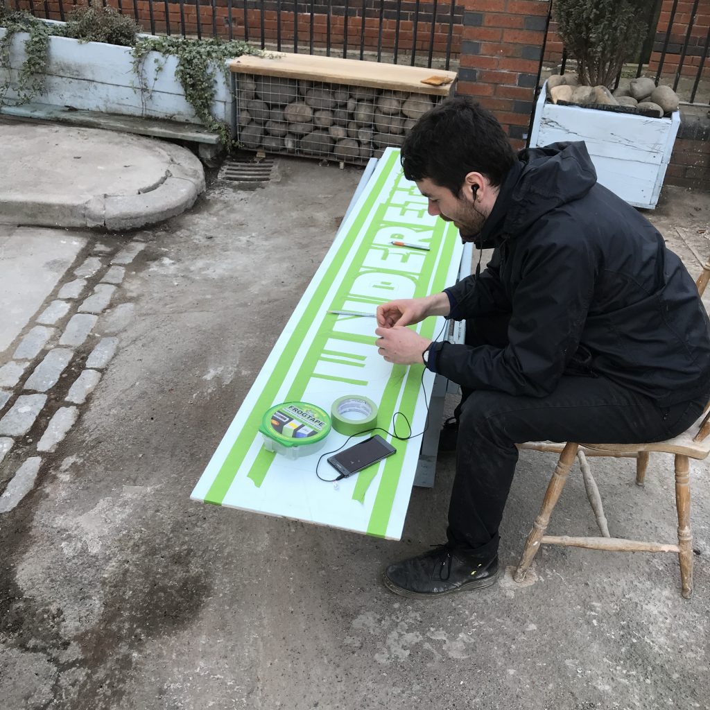
When we started to think about the shop front signage we wanted to hand-paint it, not just because we love building things ourselves but it was also more economic and it gives the launderette a homely and welcoming feel. We drew inspiration from established businesses in our local area – Handyman’s Corner, The MOT garage and Frank Greens who all have great hand-painted signage.
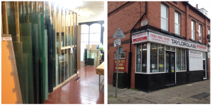
The building we are in was formerly a builder’s workshop and consequently there were many materials left in the space. Throughout the renovation work we’ve tried to re-use things as much as possible including materials for our new shopfront. This spirit of recycling and giving things a new life has been the grounding for a lot of the look and feel of the launderette.
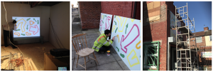
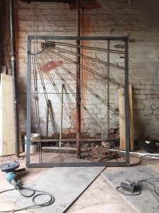
As well as the main Kitty’s Launderette sign above the door we wanted to experiment with some temporary decorative signage around the buildings exterior while building work is ongoing. I started putting the arrows from the logo onto the illustration and realised it looked like a movement diagram, a dance you could do in the launderette. Or maybe instructions on how to do the laundry “the dance you do while folding the sheets” as one of our friends and supporters once said. I like the idea of developing this into a kind of hop scotch game which we could use on the ground at the opening event.
I love how playful and imaginative we can be when doing projects like this. We can think of exciting ideas that are engaging for our community, members and workers, they’re also fun to create!
In recent weeks we have had some great volunteer days down at the site, focusing on the shopfront; helping us come on leaps and bounds with the renovation works. Tom B, Tom C, Fred and Myriam have all pitched in with painting, cleaning, carpentry and much more. It’s lovely to have new energy and input down on the site, especially on those rainy cold days!
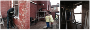
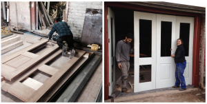
We’re creating something positive for our community so it’s been important to design the space with as much love and attention to detail as possible.
Starting with a core grounding, it’s easier to make decisions on designs and anything to do with the launderette. When we have difficult decisions to make, we can just ask whether the options fit with what we all believe in.
Once you have the basis for what the project stands for, with elements that represent that, you can see how far you can stretch the ideas. I’m looking forward to how the space continues to develop and where we can take the designs we have.
The team keep laughing at my idea of “bring your undies bunting” for our opening weekend, but I think it’s a pretty good idea!
